
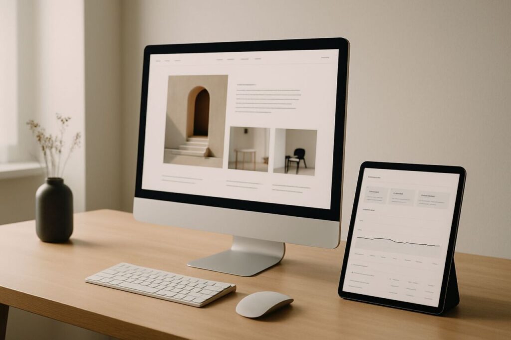
Sometimes a site is gorgeous, award‑winning… and it generates no calls, no quotes, no sales. The issue isn’t the design itself. It’s the absence of strategy, message, and a path to action. For an SMB, a conversion website is never the result of a single brushstroke: it’s the alignment between positioning, offers, content, UX, acquisition, and measurement.
What aesthetics alone can’t accomplish
A beautiful site can create an impression of quality. That’s the aesthetic–usability effect: we often judge a product easier to use because it looks good. That doesn’t replace clarity, proof, and a smooth path to action. UX research is clear: beauty without utility isn’t enough (Nielsen Norman Group).
Practically speaking, here’s where ‘gorgeous’ sites often fail:
- A visual hero that overwhelms the message: it’s hard to grasp what the company actually sells.
- Animations that slow things down, muddy the hierarchy, and distract from action.
- CTAs that are too subtle or appear too late, with no clear promise.
- Long or poorly designed forms that cause drop‑off.
- A journey misaligned with purchase intent (e.g., editorial navigation when the visitor wants a quote).
Design isn’t to blame: used in service of a strategy, it becomes a powerful lever. But on its own, it doesn’t create demand.
A conversion website starts with strategy
Before any mockup, you need a clear direction. Who are we trying to convince? With what promise and what proof? A site that converts translates a clear marketing strategy into choices around content, architecture, and interactions. Without that, you’re optimizing the look of a fuzzy message.
Key pillars:
- Ideal customer and buying priorities (criteria, objections, perceived risks).
- Value proposition that’s explicit, tested, and understandable within seconds.
- Offers and proof: customer cases, metrics, badges, demos.
- Distinct action paths by stage of awareness (discover, compare, contact, buy).
Adopting a Marketing First mindset prevents stacking up visual effects with no business impact. To structure this work, see the Marketing strategy page and, for execution, the Websites page.
Message, proof, and friction: the conversion trio
Three ingredients drive action:
- Message clarity: what you sell, to whom, with what measurable benefit. If the value isn’t obvious, the page isn’t doing its job.
- Social proof: client logos, concrete cases, reviews, certifications. Without credibility signals, perceived risk wins.
- Minimal friction: unnecessary fields, extra steps, slowness. Every obstacle kills some conversion potential.
In e‑commerce, the impact of friction is well documented: the average cart abandonment rate compiled by Baymard hovers around 70%. The takeaway is simple: reducing friction pays—more than adding an animated carousel.
Your value proposition should be understood very quickly. For a deeper dive, the article on the 10‑second value proposition offers a helpful checklist.
Useful design: hierarchy, readability, speed, and accessibility
Design becomes a competitive advantage when it makes reading easier and prioritizes action.
- Visual hierarchy: clear headings, contrasts, spacing, key elements above the fold.
- Readability: clean typefaces, controlled line lengths, helpful microcopy.
- Calls to action that are visible, consistent, and present on every decisive page.
- Loading speed: essential for the experience. Google’s Core Web Vitals guide perceived quality (responsiveness, stability, performance).
- Accessibility: sufficient contrast, comfortable tap targets, alternatives for media.
A slow site, however splendid, will lose visitors on mobile and in paid acquisition. Again, aesthetics is an asset only if it serves the job to be done.
Qualified traffic and journey: conversion doesn’t live in isolation
A conversion website requires traffic that actually matches your offer. Otherwise, you’re optimizing for the wrong visitors. Performance equals ‘traffic quality’ + ‘ability to persuade.’
Focus acquisition on queries and segments with strong affinity to your offers. The SEO & GEO page covers organic and generative engine visibility, and the Digital acquisition page covers channel orchestration. Then design natural next steps: comparison content, demos, and nurturing via email/CRM for prospects still evaluating (see CRM & Automation).
Measure, test, iterate: the mechanics of progress
Conversion improves through short cycles: hypothesis, test, measurement, decision. Three indicator families:
- Attention: dwell time on key sections, scroll depth, navigation clicks (quant + observations).
- Friction: drop‑off by step, form errors, perceived slowness, backtrack rate.
- Action: CTA CTRs, form submissions, booked meetings, sales, average order value.
A/B tests aren’t about randomly ‘changing a button color,’ but validating message hypotheses (benefit, proof, offer), journey hypotheses (short path vs guided), and friction hypotheses (removed fields, alternate contact modes). AI can accelerate analysis (segmentation, clustering feedback, generating variants) but remains a co‑pilot: the relevance of hypotheses is still human‑led.
8 quick questions to evaluate your site
- In 5–10 seconds, does a visitor clearly understand whom you serve and your value?
- Are your proofs (cases, reviews, numbers) visible where the objection arises?
- Does every key page include a clear call to action?
- What friction can you remove today (fields, steps, slowness)?
- Does your current traffic match the intents you aim to capture?
- Is the mobile journey as smooth as desktop?
- Are your Core Web Vitals and speed under control?
- What hypothesis are you testing this month to improve by +10%?
Frequently asked questions
Why doesn’t my ‘pretty’ site generate leads?
Because a visually appealing site can still be vague on value, light on proof, and heavy on friction. Without an explicit message, visible trust signals, and a simple path to action, aesthetics doesn’t trigger purchase intent.
Does design really matter for conversion?
Yes—when it serves hierarchy, readability, speed, and accessibility. ‘Useful’ design increases understanding and trust. ‘Decorative’ design can distract and add friction.
How long does it take to turn a brochure site into one that sells?
Depending on scope (message, pages, forms, performance, acquisition), expect a few weeks to a few months. The key is iteration: prioritize high‑impact pages, test, measure, improve.
What are the key metrics to steer conversion?
Track CTRs on CTAs, form completion rates, cost per lead/sale, perceived speed, and step‑by‑step drop‑offs. Combine quantitative and qualitative (session replays, short polls) to understand the ‘why.’
Can AI help me optimize conversion?
Yes—as an amplifier: analyzing verbatims, suggesting copy variants, prioritizing hypotheses. But it doesn’t replace positioning work, customer insight, or judgment about what’s worth testing.
Ready to move from a ‘pretty’ site to a ‘performant’ one? Start with strategic framing, then journey design and measurement. Let’s talk about your context.