
Many companies kick off a redesign by opening a design tool. It’s comforting: you immediately see something pretty. But six months later, the site is still vague about the offer, prospects hesitate, and the sales team has to make up over the phone for what the site failed to explain. The priorities were reversed. A successful redesign starts with marketing: the message, the offer, the journeys, and the proof. Art direction comes afterward to embody those choices—not to replace them.
Your site isn’t a portfolio; it’s a sales tool
A website’s primary job isn’t to be admired—it’s to help a customer decide. For an SMB, it’s a commercial asset: it must clarify who you are, what you sell, to whom, why it matters now, and how to take the next step. Until those answers are crisp, “making it prettier” won’t fix the problem. That’s the Marketing First logic championed by Frametonic: design is an amplifier, not a strategy.
Redesign: marketing as the starting point

When we talk about a marketing-led website redesign, we mean a project that starts with the substance: positioning, value proposition, use cases, concrete proof, and frictionless conversion journeys. Before the mockups, make the calls on:
- The message: what a visitor must understand in ten seconds.
- The offer: lines, options, limits, terms—say what you sell, not just who you are.
- The journeys: steps, content, CTAs, micro‑conversions.
- The proof: customer cases, reviews, certifications, demos, samples, contextualized numbers.
This foundation guides the site map, templates, content—and only then the art direction.
Clarify the offer and value proposition in ten seconds
If your homepage forces visitors to “guess” what you do, you’ll lose their attention. Line up a benefit‑led headline, a line of context, and a primary CTA to the logical action (explore the offer, view an entry price, book a demo). Mind the wording: use concrete language tied to your customers’ real problems, not your internal org chart.
For more on message clarity, see our “value proposition understood in 10 seconds” approach.
Design user journeys before the UI
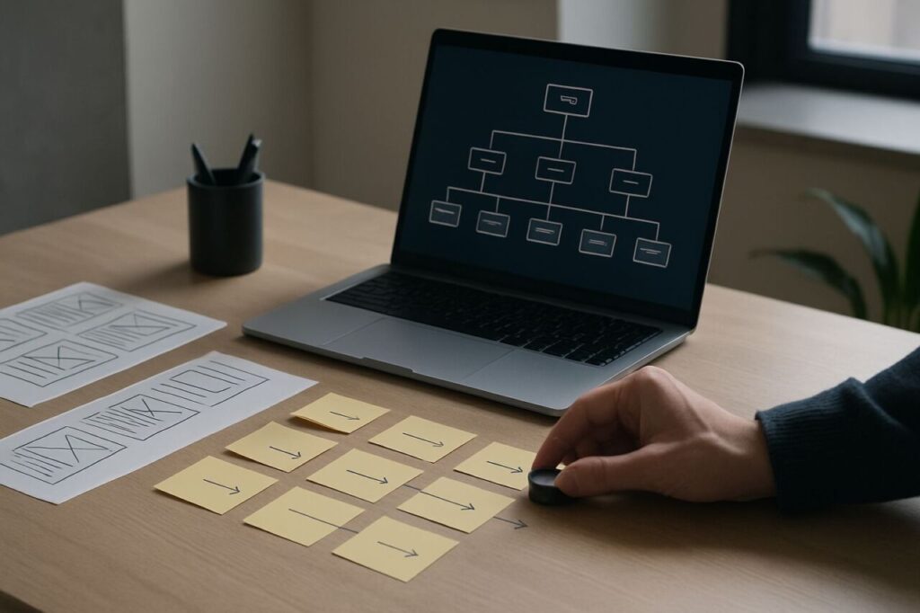
Map intents: discovery, evaluation, comparison, proof, purchase/contact. Build your pages around these steps: each section answers a specific question and objectively advances to the next. Invest in high‑intent pages (offers, pricing, use cases, industries, integrations, expert FAQs): these are what convert—not mood imagery. Place calls to action that are visible and coherent at each step: request a quote, download a brief, schedule a call, try a sample.
Visible, verifiable proof
Trust doesn’t come from a declaration, but from credible signals. Show precise customer cases (problem, solution, result), explain your methods, display reviews, specify partnerships, and include excerpts of deliverables (anonymized if needed). Avoid logos without context or generic “corporate” statements. An SMB can compete with larger players if its social and operational proof is clear.
Design and UX: when and how to step in
Design steps in once the foundation is set. It should reinforce the message, establish hierarchy, smooth the path, and reassure. Great design doesn’t “hide”—it highlights what matters: typographic clarity, section rhythm, useful contrast, visuals that explain rather than decorate. UX translates your journeys: decision‑focused navigation, offer pages without “noise,” progressive forms, unobtrusive interactions. Art direction gives the ensemble a voice and a face; it should never distract.
SEO, GEO, and AI: make the message legible to engines
A site that’s clear for humans is also more readable to Google and generative engines. Describe your entities (products, services, industries, regions), link them with logical internal linking, and clarify helpful synonyms. Write proof content (case studies, buying guides) that answers real questions. Structure pages (headings, subheadings, lists when useful) and avoid proliferating thin content. AI is a co‑pilot: it speeds production and consistency, but only a clear editorial intent guarantees quality. For a full approach, see our SEO and GEO page.
Practical method: sequence a business‑oriented redesign
- Scoping: objectives, audiences, priority workstreams.
- Positioning and offer: promise, segments, non‑negotiable proof.
- Information architecture and journeys: key tasks, “money pages,” CTAs.
- Content: editorial briefs, angles, reassurance elements.
- Design/UX: mockups that serve the message, clickable prototypes.
- Measurement and iteration: conversion KPIs, sales feedback, A/B tests.
This sequence reduces costly back‑and‑forth and speeds up launching something that actually converts.
SMB scenarios: three common patterns
The site that “talks about us” — but not the offer
Symptom: homepage centered on story and values, offers sidelined. Fix: refocus the hero on the value proposition and create clear offer pages—each with proof and a CTA.
The visual refresh with no commercial impact
Symptom: new theme, same confusion. Fix: go back to the buying journeys, rework the IA, and produce evaluation content (comparisons, use cases, pricing).
The “homemade” site that outgrew itself
Symptom: unreadable navigation; ten “Services” pages that overlap. Fix: consolidate offers, establish clear nomenclature, use reusable templates, and design internal linking for decision‑making.
Frequently asked questions about marketing‑led redesigns
Where do we start when time and resources are limited?
With a message diagnostic: who we are, what we sell, to whom, why now. In parallel, prioritize three “money pages” (offers/industries) and align their content before touching the design.
Should we rebuild the whole site or iterate in blocks?
Iterating in blocks is often more effective: you ship key pages quickly, measure impact, and continue. A “big bang” relaunch makes sense only if the identity and architecture are obsolete across the board.
How do we balance branding and commercial performance?
Positioning and branding build trust, memorability, and pricing power. Commercial performance demands clarity and smooth journeys. A good site unites both: a clear identity in service of a useful message.
Where can AI add immediate value?
Semantic research, message variants, page briefs, clarity audits, and prioritizing customer questions. AI accelerates—but it doesn’t replace judgment or strategic choice. Without a clear direction, it just automates confusion.
Which profiles should a provider bring?
A marketing lead to shape strategy and message, a UX for journeys, a writer for angle and proof, a designer for visual expression, and a developer for technical quality. Small teams can combine roles—but not skip these skills.
Preparing a redesign and want to secure business impact? Explore our site creation and redesign approach, frame your workstreams with our marketing strategy offer, or let’s talk now via the contact page. For visibility challenges, our SEO & GEO practice aligns content, structure, and proof signals.