
Changing your visual style has never been enough to win customers. For a truly marketing-first site redesign, sequence matters: start with the message, the offer, the journeys, and the proof. Only then move to art direction. That’s the core of Frametonic’s Marketing First principle: technology and design serve a strategy, not the other way around.
A site can be beautiful and ineffective
Most redesigns start with a mood board, high-fidelity comps, and animations. The common outcome: a prettier site that’s still vague about “why you?”. Without an explicit value proposition, visible credibility proof, and a thought-through conversion journey, the wrapping hides a deeper issue. Perception shapes reality: if visitors don’t quickly understand your usefulness, they leave.
Message, offer, proof, journeys: the winning order
Before any visual choice, four workstreams structure a useful redesign:
1) A clear, testable message
Your homepage must let visitors understand in seconds what you do, for whom, and why it’s better. Craft a 10-second value proposition (headline, subhead, benefits) and test it with prospects. For more, see this framing on the 10-second value proposition.
2) A structured, prioritized offer
Group your services into understandable sets. Each offer page should specify: which problem it solves, for which segment, and with what expected outcomes. Navigation must reflect this hierarchy, without unnecessary jargon. A lean sitemap beats an overloaded menu.
3) Proof, visible where decisions happen
Case studies, references, certifications, review snippets, client logos: these increase credibility when they’re contextualized (paired with the right argument, at the right moment). The principles of credibility and accessibility (for example those in the W3C – WCAG 2.2) underscore the importance of information that’s reliable, readable, and accessible to all.
4) Short, predictable journeys
Reduce the number of options and strengthen information scent so users can predict where to click and what they’ll get. UX literature, notably on Information Scent (Nielsen Norman Group), shows that precise labeling and coherent steps improve decision-making. Think primary/secondary CTAs, microconversions, and dedicated landing pages.
Marketing-first site redesign: a pragmatic method
A performance-oriented redesign follows a simple sequence:
- Diagnosis: what works (queries, converting pages, acquisition levers) and what blocks (bounce rate by segment, form friction). Cross-check analytics, CRM, and sales feedback.
- Positioning: who you target, the added value you defend, and which trust signals are must-haves by market. If needed, rework brand architecture and offer naming. See our approaches to positioning & branding.
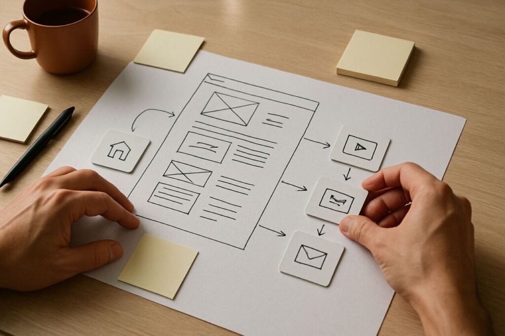
- Narrative drafting: headlines, subheads, arguments, proof, CTAs. Work page by page, first in low-fidelity wireframes. AI can speed analysis and suggest wording variants; human judgment remains decisive.
- Journeys and conversion: ensure an Offer page connects to proof, a comparison, a customer case, then a contact request. Simplify steps and forms.
- Design and prototyping: only once the narrative is validated. Art direction then serves information hierarchy and strengthens understanding.
This flow avoids “painting the facade” before building the walls. It reflects a Marketing First logic: design is an amplifier, not a substitute for meaning.
Design and UX: sharper when the substance is clear
Polished design improves perception and ease of use, but it won’t fix a fuzzy positioning. The aesthetic–usability effect (Nielsen Norman Group) shows that attractive interfaces are perceived as easier to use; however, that perception does not replace content clarity or offer–audience fit. Lock down language, hierarchy, and proof first so your UI and UX faithfully convey your proposition.
Measure impact and prep visibility (SEO/GEO)
A marketing-centered redesign should improve three things: immediate understanding, conversion, and visibility. On the search side, clarity benefits both traditional SEO and generative engines (GEO). Google’s guidance emphasizes helpful, reliable, people-first content (Creating helpful, reliable, people-first content). Concretely:
- offer pages focused on one problem, with explicit titles and answers;
- clearly named entities (sectors, technologies, places) to be understood and cited;
- verifiable, structured proof and clean semantics.
If the redesign affects site architecture, prepare redirects, data schemas, and measurement. For support, see our SEO & GEO workstream.
SMBs: when to truly change the design, and when to adapt it
A radical shift in art direction makes sense if your visual identity is obsolete, no longer reflects the company, or if ergonomics clearly hinder conversion. In many cases, an evolution is enough: more readable type, better contrast, more useful iconography, stronger page templates. What matters is that design makes your expertise, proof, and journeys more visible.
Frequently asked questions about a marketing-led redesign
Do we absolutely need to redo the visual identity to succeed?
No. If your identity is still credible, keep it and focus effort on message, offer, proof, and journeys. A targeted UX/UI evolution can be enough to unlock understanding and conversion. If your image undermines perceived quality, a branding initiative moves back to the front of the line.
How long before we get to mockups?
For an SMB, the marketing framing typically takes 2–6 weeks depending on offer complexity and source availability (customer cases, data, interviews). This phase saves time later: fewer design iterations because the narrative is clear.
What role does AI play in a redesign?
AI is a copilot: helpful for analyzing verbatims, mapping content, and proposing headline variants. Deciding the message, the order of arguments, and which proof to feature remains human. Automating without a strategic backbone just amplifies blind spots.
Can we keep the CMS and only change the content?
Often yes. If the CMS supports your templates and performance, start by redesigning the information architecture, offer pages, and proof. Tech can follow. For the website and redesign scope, see our websites page.
How do we avoid SEO loss during a redesign?
Inventory high-performing pages, preserve their topics, prepare clean 301 redirects, and maintain useful semantic coverage. Write titles and intros that clarify the query being addressed. Google’s Helpful Content guide is a solid baseline (Search Central documentation).
Considering a redesign? Start with framing: strategy, positioning, narrative, proof. If you want Marketing First, pragmatic support, explore our approaches to marketing strategy and site redesign, or get in touch.
Sources and references
- Creating helpful, reliable, people-first content — Google Search Central
- Aesthetic-Usability Effect — Nielsen Norman Group
- Information Scent — Nielsen Norman Group
- Web Content Accessibility Guidelines (WCAG) 2.2 — W3C